
John Deere’s transformation from a small blacksmith shop in Grand Detour, Illinois, to one of the most recognizable names in agriculture is a story of both innovation and strong branding. While the company’s first steel plow was built in 1837, the legendary leaping deer logo would not make its debut until nearly 40 years later.
This post explores the evolution of the John Deere logo — when it began, how it changed, and why it still stands as one of the most enduring emblems in American business.
John Deere Logo Origins (1837–1868)
John Deere, a skilled blacksmith, introduced his polished-steel plow in 1837, changing farming in the Midwest forever. For decades, the business grew without an official symbol. In 1868, more than 30 years after its start, the business was officially incorporated as Deere & Company, setting the stage for a lasting brand identity.
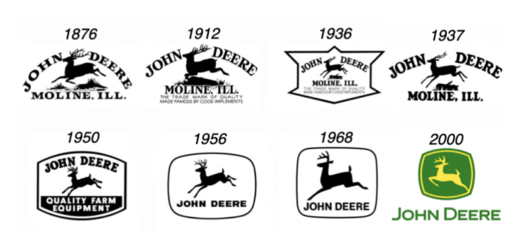
John Deere Logo Evolution Guide
- 1876: The First John Deere Logo
- 1910: A Sharper, More Defined Deer
- 1936: Sleek Silhouette for a New Era
- 1937: Centennial Logo with Lasting Impact
- 1950: Bold Look with “Quality Farm Equipment”
- 1956: Confident Design Without a Slogan
- 1968: Bigger Deer, Slimmer Frame
- 2000: Forward Leap into the Future
1876: The First John Deere Logo

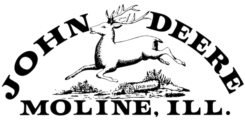
Year Introduced: 1876
Initial Design:
- The logo featured a deer leaping over a log and was modeled after a non-American deer species often described as resembling an African deer rather than the North American white-tailed deer.
- It was officially registered in 1876, although it had been in use since 1873.
- This version was introduced during a period when Deere & Company was producing more than 60,000 plows annually.
- The trademark registration helped protect the brand against imitation and established a trusted visual identity for customers.
1910: A Sharper, More Defined Deer

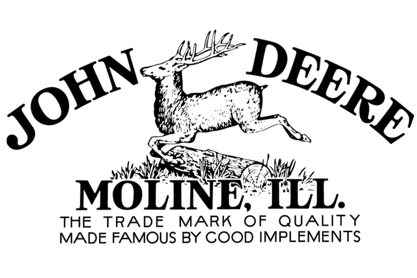
Year: Officially registered again in 1912 following an update introduced in 1910
Modification:
- The second John Deere logo was officially registered during this period, although it had already been in use since 1910.
- The deer was shown mid-leap over a log with more refined detail and sharper definition.
- This version also introduced the slogan, “The Trade Mark of Quality Made Famous by Good Implements.”
- That slogan reinforced John Deere’s growing reputation for dependable farm equipment.
1936: Sleek Silhouette for a New Era

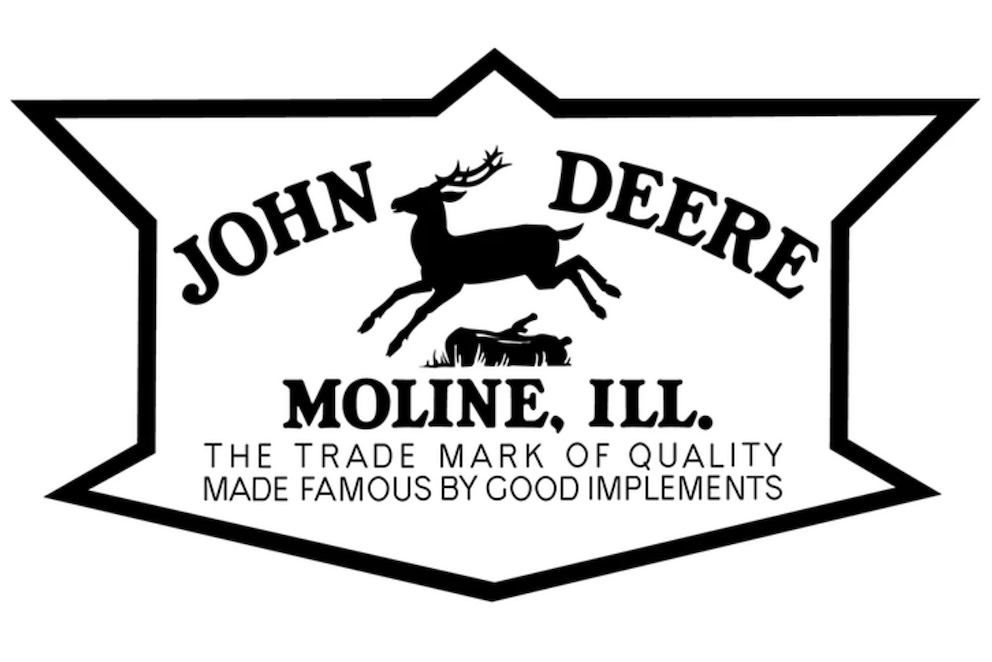
Year: 1936
Modification:
- The deer was updated to a smooth, solid silhouette to create a cleaner, stronger look.
- The simplified lines made the logo easier to stencil onto equipment.
- This version also introduced a 12-sided border as the sole frame containing the John Deere name and emblem.
1937: Centennial Logo with Lasting Impact

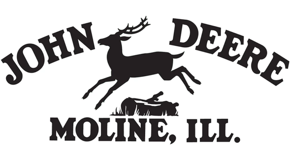
Year: 1937
Modification:
- John Deere released a cleaner, more streamlined logo to celebrate the company’s 100th anniversary, just one year after other updates were made.
- This version featured the company name, the leaping deer, and its home city.
- It also removed the framed border.
1950: Bold Look with “Quality Farm Equipment”

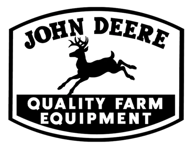
Year: 1950
Design change:
- This version introduced the slogan “Quality Farm Equipment” to capture the brand’s promise in three words.
- It returned to a framed design to create a more unified appearance.
- The log beneath the deer was removed to give the logo a cleaner look.
- The antlers appeared more forward-facing, contributing to a more dynamic and alert stance.
1956: Confident Design Without a Slogan
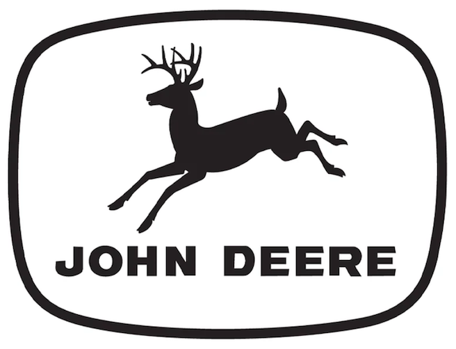
Year: 1956
Modification:
- John Deere retired the slogan “Quality Farm Equipment” as the company’s reach extended far beyond agriculture.
- This update allowed the bold John Deere name and the iconic leaping deer to stand proudly on their own.
- It also aligned with the brand’s growing diversification into construction, forestry, and other growing industries.
- Overall, this version captured a new era of global growth and rising worldwide recognition.
1968: Bigger Deer, Slimmer Frame
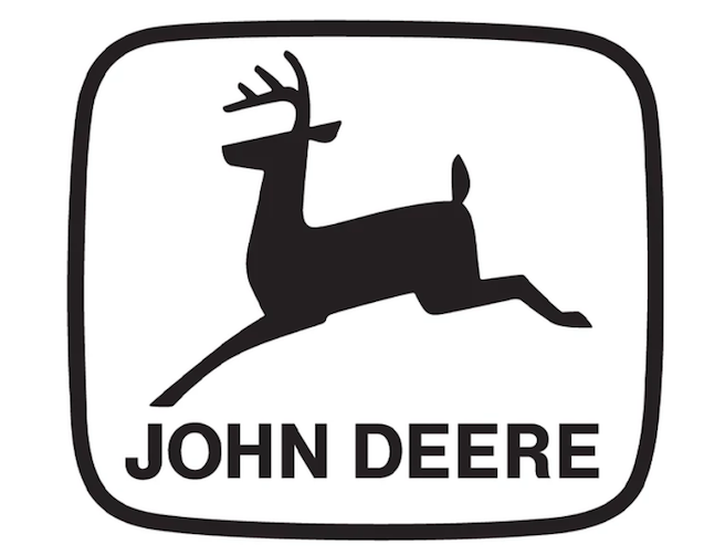
Year: 1968
Modification:
- This update gave the John Deere logo a sharper, more modern edge that reflected the brand’s momentum.
- The leaping deer was transformed into a bold, straight-sided silhouette, making it easier to reproduce on equipment and marketing materials.
- The ellipse border was also slimmed down to create a cleaner, sleeker frame.
- The larger deer within the emblem reflected John Deere’s growth and rising influence in the global agriculture and equipment industries.
2000: Forward Leap into the Future

Year: 2000
Modification:
- John Deere unveiled a defining transformation of its logo at the start of the new millennium.
- The deer’s leap became more dynamic and upward-angled, emphasizing motion and forward progress.
- The deer’s stance was also refined with sharper leg and antler angles to give it a more powerful, athletic look.
- A bold silhouette helped reflect the brand’s focus on innovation and leadership.
- At the same time, the redesign maintained John Deere’s heritage while signaling its readiness for a technology-driven future.
John Deere Logo History Timeline
| Year | Key Change | Notable Features |
| 1876 | First trademark | African deer leaping over a log; officially registered though in use since 1873 |
| 1910 | Added detail and slogan | “The Trade Mark of Quality Made Famous by Good Implements” |
| 1936 | Simplified | Smooth, solid silhouette; easier stenciling; 12-sided border frame |
| 1937 | Centennial redesign | Cleaner, streamlined logo; included company name, leaping deer, and home city |
| 1950 | Modernized | Removed log, added “Quality Farm Equipment” |
| 1956 | Confident expansion | Removed slogan; only company name and deer; reflected growth into construction and forestry |
| 1968 | Streamlined | Bold, straight-sided silhouette; slimmer ellipse border; larger deer symbolizing growth |
| 2000 | Dynamic Leap | Deer shown mid-leap; sharper angles; bold, muscular silhouette; upward motion for progress |
John Deere Logo History Fun Facts
- The first deer wasn’t native to North America — it was modeled after an African species.
- The John Deere logo is one of the longest-running trademarks still in active use in the U.S.
- The logo has had several major updates over its 150-year history.
- While it has evolved over the years, every John Deere logo has consistently stood for the same core values: quality, integrity, humanity, innovation, and commitment.

The Legacy of John Deere Logo
From a detailed deer bounding over a log in 1876 to today’s bold, forward-leaning silhouette, the John Deere logo has evolved to match the times while honoring its agricultural heritage.
Each update has balanced tradition, clarity, and modern appeal, making it one of the most recognized and trusted brand marks in the world.
Explore John Deere equipment on MachineFinder to see how the brand’s legacy continues across today’s lineup of tractors, mowers, combines, and more.


John Deere Logo Evolution FAQs
When was the first John Deere logo introduced?
John Deere’s first trademarked logo was officially registered in 1876, inspired by a version the company had been using since 1873. This early emblem featured a leaping deer above the words “John Deere” and represented the brand’s growing identity in American agriculture.
Why does the deer leap forward in the current design?
The forward leap reflects John Deere’s values of progress, innovation, and leadership. It visually communicates the company’s mission to keep advancing technology and equipment that help farmers, turf professionals, and builders work more efficiently.
Has the slogan always been part of the logo?
No. While memorable slogans like “Nothing Runs Like a Deere” have appeared alongside the emblem in advertising, the official logo often features only the deer and the John Deere name to maintain a clean, instantly recognizable design.
What was the purpose of the 2000 logo redesign?
The 2000 update made the deer’s leap steeper and more athletic, tightened the lines, and brightened the green-and-yellow colors. These changes were made to convey more energy, strength, and motion, ensuring the logo looked modern while staying true to its heritage.
How many versions of the John Deere logo exist?
Over its history, John Deere has introduced several major logo designs. Each redesign refined the deer’s appearance—sharpening details, adjusting proportions, and changing posture—while preserving the core leaping deer symbol.
What do the green and yellow colors mean?
The green in the logo represents farmland, growth, and sustainability, while the yellow symbolizes harvest, energy, and optimism. Together, they reflect the company’s agricultural roots and commitment to productivity.